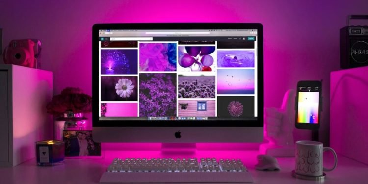
Colors are more than simply a visual element. When the human brain encounters specific colors, a subconscious phenomenon occurs. For instance, when we think of McDonald’s golden arches, we visualize a yellow ‘M’. It’s never green or blue, just yellow.
Colors are powerful tools that shape perceptions and give the brain cues toward particular actions. Color evokes emotions almost reflexively. Looking at a bright red screen, for instance, provides a vastly different emotional response than looking at a sky-blue screen.
In web design, thoughtful use of color can change how users interact with a website, guiding them subtly yet effectively toward the desired outcome. By understanding the psychology behind colors, designers can craft experiences that resonate with their users and reflect their brand identity.
Let’s go deeper into this intriguing world of color psychology and how it affects user behavior.
The Science of Color Psychology
Color psychology studies how different hues influence human behavior and decision-making.
Research on color association, or color semantics, points out the strong association we have with specific colors, like fire trucks, symbolized by the color red. The color is also easily recognized by the eye, unlike other colors. According to the research, these associations are not accidental. They are, in fact, rooted in biology and social conditioning.
Colors matter more than companies realize. Tropicana lost $30 million in sales when it redesigned the juice packaging, as customers didn’t recognize the brand without the bright orange and the straw.
This shows how humans interpret colors and make judgments. Similarly, the color scheme of a website or brand can significantly impact whether a user decides to engage with the content or abandon it.
The Role of Color in Web Design
First Impressions
Most often, an online user’s first impressions of a website are related to design, and color plays a significant role in this. The right color combinations can immediately convey professionalism and trustworthiness, encouraging users to explore further.
Colors also help differentiate between brands from other competitors easily.
Emotional Impact
Colors directly affect the brain’s emotional center. The color Red can create an urgency to buy, so many websites put it on the CTA, the call to action button, with the label ‘Buy Now’ or ‘Limited Offer.’
Blue, on the other hand, inspires calmness and trust, so websites of financial institutions or large corporations like IBM use it. IBM has even officially incorporated the blue color, announcing that it symbolizes its brand identity.
Guiding User Behavior
Colors direct the user’s attention, helping them navigate a website. Highlighting buttons, emphasizing CTAs, or signaling warnings with color hues improves usability.
For example, the sign-up button has to be a bright color like yellow or orange to direct the user’s attention. If it blends with the background colors, half of the users will not even notice it.
Successful Uses of Color in Web Design
When you examine how brands use colors, the art of color psychology begins to unfold. Companies like Coca-Cola, Pepsi, and McDonald’s use ‘fiery’ colors that attract attention, like yellow and red.
Brand websites like Starbucks and Spotify use the color green to symbolize energy, sustainability, and growth. To make the primary color stand out, neutral blacks or plain whites are contrasting colors.
The Airbnb website uses pastel tones to evoke a sense of belonging. The soft red in the logo adds a personal touch, while neutral backgrounds ensure a clean, user-friendly interface.
Amazon is another great example. Even though it has a lot of options, the interface is designed to be clutter-free and easy to understand for quick shopping. The ‘Add To Cart’ button is highlighted in bright colors to ensure conversion.
Businesses can learn from this and use colors scientifically to influence user behavior. Hocoos notes that AI-based web design solutions make it easy to create different web layouts and customized color schemes.
Best Practices for Using Color in Web Design
The first step is to maintain consistency and ensure a cohesive color palette. This will reinforce your brand identity and ensure the user perceives the brand as professional.
The website should be designed by testing color schemes and making use of contrast, like a white background with a red button, for easy visual guidance.
One can design the website with inclusivity in mind by using accessible color combinations that work even with users who have color vision deficiencies. Tools like color contrast checkers can ensure that accessibility standards are maintained.
Colors Are Life
We may not have realized it before, but user behavior is affected by colors a lot more than anyone can perceive. Colors are much more than just a design choice. They’re a tool for observing user behavior and interaction. The psychology of colors can help businesses create visually appealing and highly effective websites.
When color is used intentionally, it becomes a bridge between a brand’s identity and its customers’ needs.


